About Tobias Ahlin

I love to design and make things. I used to make things at Spotify and Minecraft, and am currently a design engineer at GitHub.

The RSS's url is : https://tobiasahlin.com/feed.xml

Please copy to your reader or subscribe it with :

Preview of RSS feed of Tobias Ahlin

Responsive type scales with composable CSS utilities

2023-09-22 09:12:00

If you’ve ever attempted to create responsive type that seamlessly adapts and scales between pre-determined sizes within a type scale based on viewport or container widths, you may have wrestled with JavaScript or wrangled with CSS calculators. But with the help of calc(), clamp(), and a somewhat wonky use of CSS vars, we can simplify this process and tap into the dynamism that modern CSS affords. We can create truly fluid type scales, with composable and responsive type utilities that let your type resize and adapt to the viewport or container width.

Here’s a demo of what we’ll set up (resize the browser window to preview the effect—it works in the latest version of all major browsers):

32px - 124px
Whereas recognition of the inherent dignity
24px - 80px
Whereas recognition of the inherent dignity
16px - 64px
Whereas recognition of the inherent dignity
12px - 48px
Whereas recognition of the inherent dignity

What follows is an in-depth exploration of how to achieve this effect. If you simply whish to drop this functionality into a project, I’ve collected a range of type scale CSS utilities—with breakpoint classes and other methods of achieveing higher granularity of type control—in a small type scale library called bendable.

Jumping through hoops

Creating this calculation should, in theory, be reasonably straightforward, but the rigidity of CSS calc() can make the process feel like you’re navigating a semantic minefield. Unfortunately, CSS calc() does currently not allow for implicit conversions between unitless numbers and pixel values, so getting the syntax exactly right can be tricky. These restrictions have been relaxed in the css-values-4 spec, but until those changes are implemented and widely supported in browsers, we’ll have to work around the current limitations.

One method of bypassing the current limitations is to, whenever possible, pass around values as unitless numbers, not as pixel values, and then convert them to pixels when we need them as pixels (by multiplying them with 1px). With this strategy, we can achieve adaptive type that stays true to a pre-determined type scale. Here’s a breakdown of the calculation (line breaks and comments for clarity):

.container-adaptive {
  --font-size: calc(
    /* Minimum size in pixels -> the starting point */
    var(--min-size) * 1px +
    /* Diff between min and max -> how much should we add in total? */
    ((var(--max-size) - var(--min-size)) *
      /* Container size minus starting point -> how far are we? */
    (100cqw - var(--container-min) * 1px) /
    /* Diff between min and max container width -> the range */
    (var(--container-max) - var(--container-min))
  );

  /* Clamp between min and max, to avoid overshooting */
  font-size: clamp(var(--min-size) * 1px, var(--font-size), var(--max-size) * 1px);
}

Unpacking the calculation

In plain English, the formula to calculate the font-size is minimum font size + diff between min and max font size * current container width relative to its min and max values. In its enterity, it reads calc(var(--min-size) * 1px + (var(--max-size) - var(--min-size)) * (100cqw - var(--container-min) * 1px) / (var(--container-max) - var(--container-min))). Again, the calculation is a bit tricky to get right with CSS calc(), and looks a bit wonky, because we:

In other words, when performing addition and subtraction, both values need to be of the same format. When conducting division and multiplication, at least one of the arguments must be a unitless number. To ensure the calculation works within these constraints, we initially set all values as unitless numbers and convert them to pixels when needed.

When it all comes together, our variable and calculation setup can then look like something like this (notice the variables’ lack of px units—pixels are implied in all of these variables):

:root {
  --min-size: 12;
  --max-size: 18;
  --container-min: 320;
  --container-max: 2400;
  --viewport-min: 320;
  --viewport-max: 2400;
}

.container-adaptive {
  --font-size: calc(var(--min-size) * 1px + (var(--max-size) - var(--min-size)) * (100cqw - var(--container-min) * 1px) / (var(--container-max) - var(--container-min)));
  font-size: clamp(var(--min-size) * 1px, var(--font-size), var(--max-size) * 1px);
}

.viewport-adaptive {
  --font-size: calc(var(--min-size) * 1px + (var(--max-size) - var(--min-size)) * (100vw - var(--viewport-min) * 1px) / (var(--viewport-max) - var(--viewport-min)));
  font-size: clamp(var(--min-size) * 1px, var(--font-size), var(--max-size) * 1px);
}

Finally, we use clamp() to avoid overshooting our min and max values. With this specific setup, the font size will be set to 12px when the container or viewport is 320px or smaller, scale linearly from 12px to 18px between a container/viewport size of 320px and 2400px, and then stop at 18px when the container or viewport width reaches 2400px. To set the size relative to the viewport size, we use the vw unit, and to set it relative to the container, we use the cqw unit.

Setting up utilities

With that as our starting point, we can set up a few utilities to independently set the maximum and minimum values, to easily scale between two points in a type scale:

:root {
  --min-size: 12;
  --max-size: 18;
  --container-min: 320;
  --container-max: 2400;
}

/* Setup size calculation for all max utilities */
.h1-max, .h2-max, .h3-max, .h4-max, .h5-max, .h6-max, .h7-max, .h8-max {
  --font-size: calc(var(--min-size) * 1px + (var(--max-size) - var(--min-size)) * (100cqw - var(--container-min) * 1px) / (var(--container-max) - var(--container-min)));
  font-size: clamp(var(--min-size) * 1px, var(--font-size), var(--max-size) * 1px);
}

.h1-max { --max-size: 128; }
.h2-max { --max-size: 96; }
.h3-max { --max-size: 64; }
.h4-max { --max-size: 48; }
.h5-max { --max-size: 32; }
.h6-max { --max-size: 24; }
.h7-max { --max-size: 16; }
.h8-max { --max-size: 12; }

.h1-min { --min-size: 128; }
.h2-min { --min-size: 96; }
.h3-min { --min-size: 64; }
.h4-min { --min-size: 48; }
.h5-min { --min-size: 32; }
.h6-min { --min-size: 24; }
.h7-min { --min-size: 16; }
.h8-min { --min-size: 12; }

With those utilities, this markup effectively reproduces the demo in the beginning of the post:

<!-- Mix and match as you wish -->
<h1 class="h5-min h1-max">...</h1>
<h2 class="h6-min h2-max">...</h2>
<h3 class="h7-min h3-max">...</h3>
<h4 class="h8-min h4-max">...</h4>

…but you can use any combination of max and min utilities to easily change the start and end sizes, and it’ll all smoothly scale between those two sizes.

The versatility of fluid and adaptive typography presents a range of exciting possibilities. I’ve explored this concept further in a small type scale library called bendable, which captures these techniques in the form of a responsive type scale, with some extra sugar on top.

Limitations

An important and significant limitation of this technique, because of the existing CSS calc() restrictions, is that you currently can’t use rems to set your type. This limitation will be resolved as browsers add support for the relaxed calc() restrictions, but until then, this technique is limited to use px units.

Hiding empty elements with CSS :empty and :has()

2023-03-15 09:05:00

You might be used to adding and removing .open and .closed classes on divs and containers to control their state styles. What if we could just write CSS that reflected the state of the DOM, without having to additionally handle state by toggling classes? In this post, we’ll explore how to hide elements with the :empty pseudo-class if they have no children, and how to make the pattern more granular and practical when we combine it with :has() and :not().

Hiding an empty element

The :empty matches any element that has no children. The pseudo-class is supported by all major browsers, and is safe to use even if you’re targeting Internet Explorer. We can use it in combination with the display property to hide an element if it’s empty:

.container:empty {
  display: none;
}

In this example, the :empty pseudo-class is used to select elements with the class .container that have no children (including text nodes), and the display: none rule is used to hide them.

<!-- This will be visible -->
<div class="container">Some text</div>

<!-- This will be hidden -->
<div class="container"></div>
Some text

Hiding an element that has an empty child

Assume that we have a some HTML markup that looks something like this, that we dynamically populate with suggestions inside of .results

<div class="container">
  <h4>Suggestions</h4>
  <div class="results">
    ...
  </div>
</div>

…and we want to hide the entire .container when the .results div is empty (since the container itself will never be empty). For scenarios like this, we can combine the the :empty pseudo-class with :has(), to hide any .container that has an empty .results div:

.container:has(.results:empty) {
  display: none;
}
<!-- This will be visible -->
<div class="container">
  <h4>Suggestions</h4>
  <div class="results">
    <div>Result 1</div>
    <div>Result 2</div>
    <div>...</div>
  </div>
</div>

<!-- This will be hidden -->
<div class="container">
  <h4>Suggestions</h4>
  <div class="results"></div>
</div>
Suggestions
Result 1
Result 2
...

Here, .container selects all .containers, and then :has() filters them to only those that have an empty .results div. Note that .has() is only supported by 84.68% of all major browsers, and you may want to use a polyfill while awaiting broader support.

Hiding a parent element that doesn’t contain a certain child

You can equally choose to hide a container based on if it doesn’t contain a certain child, say a .result. Imagine that our markup looks something like this, where we return a series of .result divs:

<div class="container">
  <h4>Suggestions</h4>
  <div class="result">...</div>
  <div class="result">...</div>
  <div class="result">...</div>
</div>

For a scenario like this, we can combine the :not() pseudo-class with :has() to hide the .container if it doesn’t contain any .result elements:

.container:not(.container:has(.result)) {
  display: none;
}
<!-- This will be visible -->
<div class="container">
  <h4>Suggestions</h4>
  <div class="result">Result 1</div>
  <div class="result">Result 2</div>
  <div class="result">...</div>
</div>

<!-- This will be hidden -->
<div class="container">
  <h4>Suggestions</h4>
</div>
Suggestions
Result 1
Result 2
...

Here, we start by selecting all .container elements, then we exclude elements from that list with :not(), and we exclude all .container elements that contain a .result. What remains is any .container that doens’t include a .result, and we use display: none to hide it. Note that unlike :has(), :not() is actually supported by all major browsers, and can safely be used without a polyfill.

We might not be able to avoid toggling classes completely to handle states, but with the help of these patterns we can to a larger extent let our styles be a function of the content that’s being displayed, and build more robust experiences.

Selecting previous siblings with CSS :has()

2023-03-09 20:05:00

One of the more maddening limitations of CSS was for long its inability to select elements based on their children or preceding siblings. This made it impossible to construct CSS selectors that could target previous siblings of an element, but the has:() pseudo-class (along with :not(), :where(), and :is() from Selectors Level 4) has thrown out the old limitations and opened up a new world of possibilities when working with selectors.

As of this writing, :has() is supported by 84.68% of all major browsers (including Chrome and Safari), with Firefox being the notable exception. Experimental support for Firefox launched in July 2022 and can be enabled through the flag layout.css.has-selector.enabled—you can track the progress through this Bugzilla issue. Until that ships, you can use the :has() pseudo-class if you’re not targeting or supporting Firefox, or if you use a polyfill.

Selecting the previous sibling

Imagine that we have a series of elements, like this:

<div class="box"></div>
<div class="circle"></div>
<div class="box"></div>

…and we want to select and style the element that comes before the circle. The adjacent sibling combinator (+) can select an element that immediately follows another element, and we can combine it with :has() that to select only the .box that’s immediately followed by a .circle (or from the circle’s perspective, its previous sibling):

.box:has(+ .circle) {
  width: 40px;
  height: 40px;
}

You can think of this selector as first 1) selecting all boxes, and then 2) filtering the elements to only those that match the pattern “box + circle”, which will only return the circle’s previous sibling.

Selecting the nth previous sibling

It’s possible to use the adjacent sibling combinator to select any specific element that preceds another. We can select the 2nd previous sibling by using two adjacent sibling combinators:

.box:has(+ * + .circle) {
  width: 40px;
  height: 40px;
}

If you want to, you can equally scope the selector to a class (rather than the catch-all *). In this instance .box siblings:

.box:has(+ .box + .circle) {
  width: 40px;
  height: 40px;
}

This selector can be difficult to grok and parse. It might help to think of it as selecting all boxes (.box), and then filtering those elements so that the remaining .box is the one that matches the pattern “self + box + circle”, which will only be the 2nd previous sibling.

If you want to select the 3rd previous sibling, you can use three adjacent sibling combinators…

.box:has(+ * + * + .circle) {
  width: 40px;
  height: 40px;
}

…and so on and so forth. You can keep on adding adjacent sibling combinators (+) for as long as you want, to select any nth preceding element.

Selecting all preceding siblings

If you want to select all previous siblings, you can combine the :has() pseudo-class with the general sibling combinator (~), which matches the second element as long as it follows the first, regardless of its position:

.box:has(~ .circle) {
  width: 40px;
  height: 40px;
}

In other words, as long as the .box in this example is followed by a .circle at some point, the .box will be selected and styled.

Selecting all preceding siblings except the most adjacent sibling

Finally, we can combine the general sibling combinator (~) with the adjacent sibling combinator (+) and select all preceding elements except the most adjacent one:

.box:has(~ * + .circle) {
  width: 40px;
  height: 40px;
}

This selector selects any .box that matches the pattern “self followed by at any point a box + circle”.

A brief introduction to A/B-testing

2020-05-20 15:50:00

A/B-testing is a guiding compass for making product decisions. More technically, it’s a method for quantifying the impact of product variations. The process can’t tell us if one variation is unequivocally “better” than another, but it can tell us which of a set of variations is better at producing a certain effect, encouraging a behavior, or achieving a goal.

The basic method is similar to a clinical trial with a placebo group. By testing two or more variations of an experience (labeled A, B, C, etc.) and measuring how they cause similar groups of people to behave differently on average, we can assess a design’s impact. What we need at the minimum, then, is one control (A), one variant (B), and a random sample of users. The two versions could be our product in its current state, and a new idea that we want to compare it against:

A/B test variants

At a surface level, A/B testing is as simple as that: build two variations of something and measure the difference in behavior.

Incrementalism and learning

Before we go into the details of running such a test, let’s take a step back and examine the underlying thought process. A philosophy that’s usually coupled with A/B-testing is incrementalism: the idea that we can build great products, make innovative leaps, and overcome daring obstacles by implementing gradual and measurable improvements. A vision can guide this iteration and experimentation, but rather than acting as a blueprint that gets fully built and realized in one humongous project—a risky and expensive endeavor—that vision typically serves as a north star. Small incremental improvements build up and inch us ever closer towards it, but experiments feedback into the vision and slowly transform it over time, placing the north star forever out of reach.

To embrace this philosophy and effectively accumulate insights and improvements through experimentation, we need to foster a culture and process that supports learning. If we don’t, we risk going in circles—running tests that have no impact, and that teach us nothing new. An important goal for a data-driven design organization is not just making an impact but learning as quickly as possible about a moving target. We need to allocate our resources based on how promising our different strategies seem at any given point. What’s worth focusing on will vary over time as your product and audience grows and transforms, and it’s something that you will have to learn and relearn continuously.

With learning as a core pillar of this philosophy, we can map experiment-driven design as a circular process of building, measuring, and learning:

A/B test process

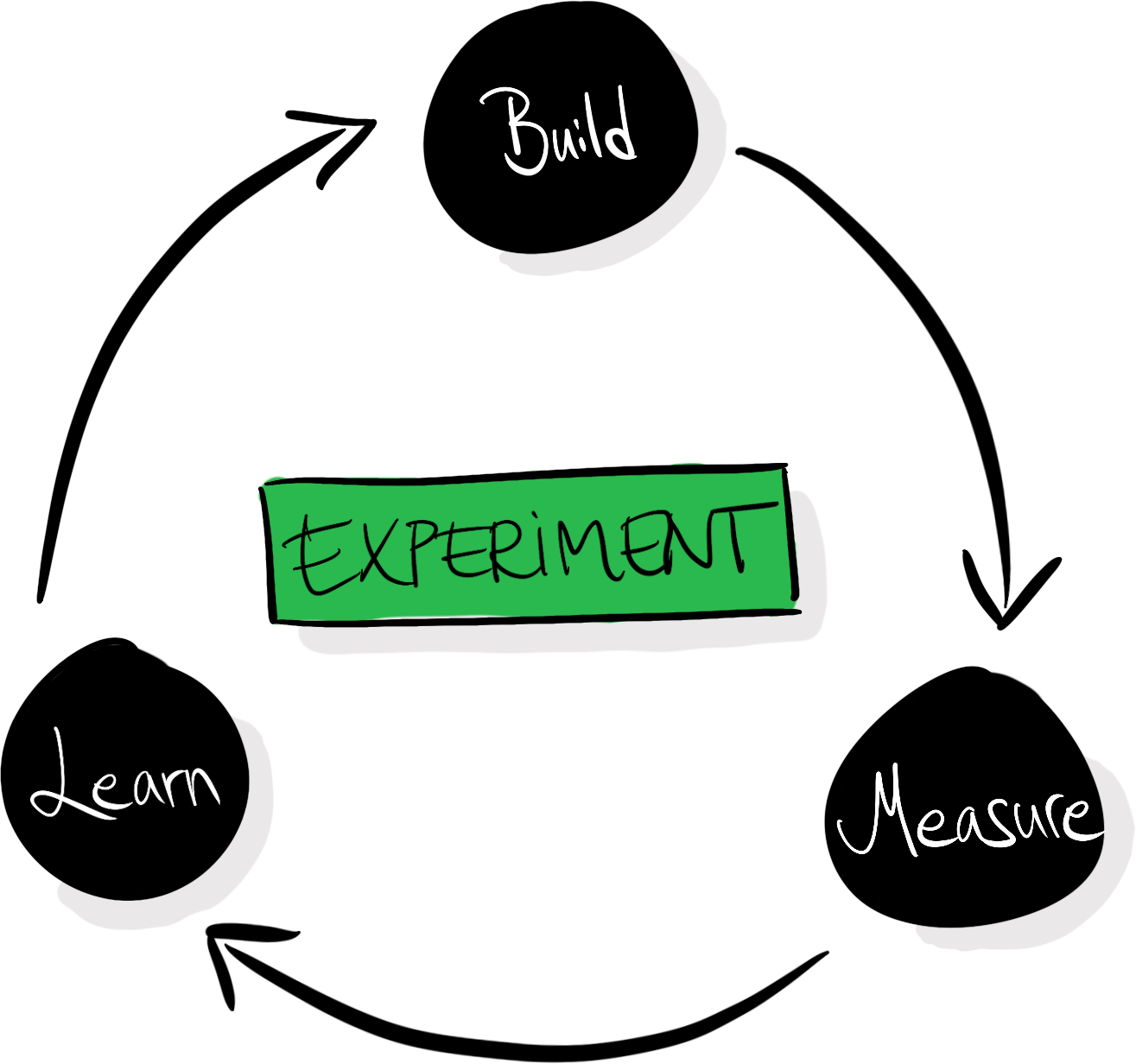
Every test doesn’t necessarily have to make your product better—but every test should teach you something. The A/B-testing process usually includes the articulation of hypotheses to facilitate that learning: we make sure that we capture our beliefs before running tests so that we can compare them with our new beliefs that we’ve acquired after seeing the results.

At a more granular level, an A/B-testing process can look something like this:

  1. Ideate: Come up with one or more ideas that you want to test, based on your previous data, experience, problems, and goals.
  2. Hypothesize: Define hypotheses for each idea, outline why you think those ideas could have an impact, and what result you expect to see.
  3. Plan: To gaurd against your own biases and what you want to believe, you can tie different outcomes to follow-up actions before running the test. Define an array of outcomes, and tie those outcomes to different follow-up actions.
  4. Create: Design and implement the variations you believe in most.
  5. Expose: Ship the variations to a subset of your users in a randomized trial.
  6. Wait: Wait for the tests to get enough exposure to offer meaningful insights.
  7. Analyze: Analyze the data from the test.
  8. Deliberate: Discuss what the results mean and how they validate or disprove your hypotheses.
  9. Ship, iterate, or abandon: Based on your learnings, roll out a variation to all users, iterate on a direction before running another test, or abandon ideas in favor of exploring other directions.

Running a test

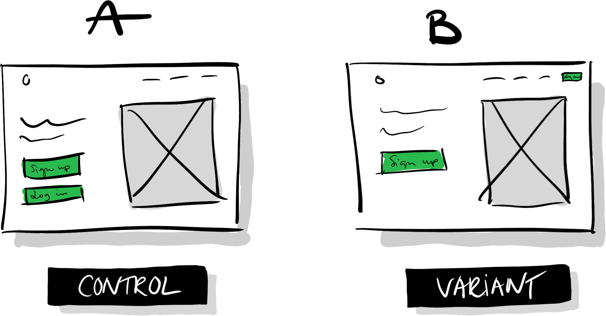
Say that we have a website that looks like illustration A (control) below: we have a logo in the top left, a menu in the top right, an image of our product, a header, and a short description. We then have two large buttons visible above the fold: “Sign up” and “Login.”

A/B test variants

Someone in our organization has proposed that we should move the “Login” button to the menu in the top right, and keep the “Sign up” button as is (B). They hypothesize that making the “Sign up” button the most prominent call to action will cause more people to see it, which will lead more people to sign up.

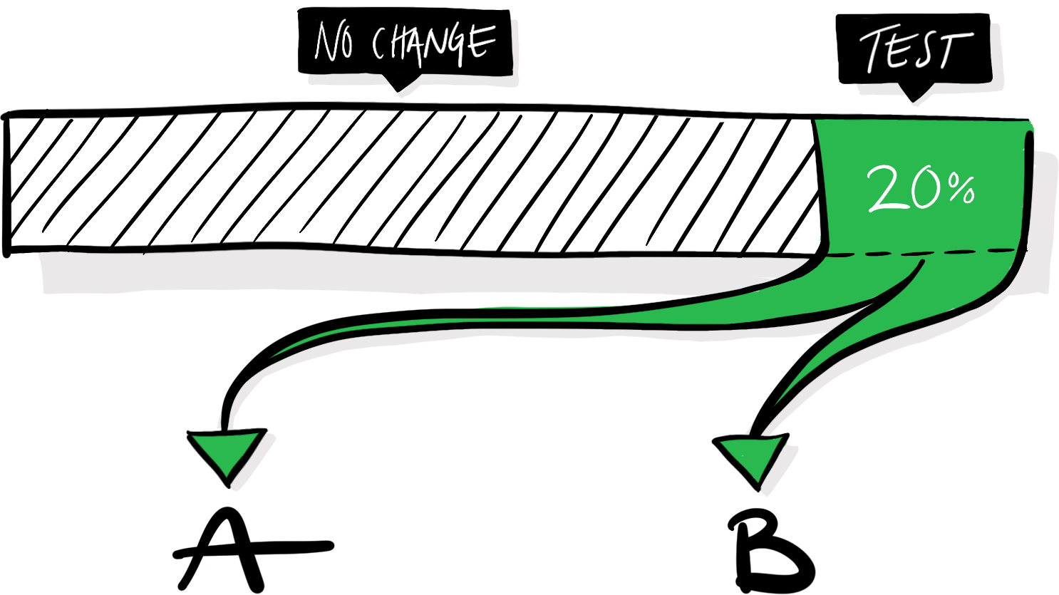
To measure the impact of that change, we need to implement design B and expose a random subset of our users to it, alongside the default experience, which will act as a control. The exact proportion of our visitors (here 20%) that you enroll in a test will vary depending on the test and circumstances. The more users that get enrolled in an experiment the faster you’ll get the data that you need to analyze it, but make sure to not expose more users than necessary. After all, a variation might mistakenly make your product worse, and you want to mitigate any potential negative effects. In our hypothetical scenario, half of the visitors assigned to the test will see variation A, and half of them will see variation B.

A/B test distribution

The experiences are identical in every single aspect except the moved “Login” button. If we see that people using the B-version of our website are more likely to sign up, we can conclude that the altered button causes that effect.

In other words, we can establish a causational relationship between design B and a behavioral change: an increase in sign-ups. Not just a correlation—this is why we need a control group to compare against. If we implement B, launch it to all our users, and then notice an increase in sign-ups, that increase would only correlate with the launch of the new design—it could as well be caused by a random tweet, a holiday, or a mention in a podcast. We wouldn’t know for sure, so we wouldn’t be able to draw any conclusions about the effects of the new design.

We also need the users to be randomly assigned to each cell to infer a causal relationship. If we select users for the cells by different criteria and end up with more engaged users in one of the groups, it might make that cell perform better regardless of the introduced change: the skewed selection of users is already more engaged on average. If we randomize the distribution of users, we can expect that all attributes (engagement, age, experience, etc.) are equally distributed between the groups, and won’t influence the outcome.

You become what you measure

Presume that we run this test, and after analyzing it, we see a statistically significant four percentage-point increase in sign-ups for variation B:

A/B test success

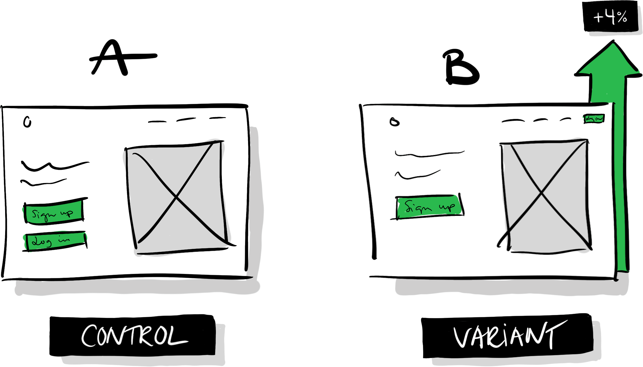
Variation B looks like a clear winner! Should we launch it? Here’s where we need to return to the notion that an A/B-test can’t tell us if B is unequivocally better than A. If our team’s goal is to increase sign-ups and we only measure sign-ups to assess if our tests are successful or not, we’ll likely run precisely these kinds of tests, where we promote the one feature connected to our goal while neglecting or diminishing other features. In this instance, the result can be a slow but steady accumulation of changes that taken together go against common sense: we’ll make it increasingly difficult for already signed up users to access the product.

If the only thing we measure is the metric that’s fundamental for our success, we have a destructive setup that will enforce skewed incentives to promote features connected to our goal while neglecting other parts of the experience. If other teams in the same organization have similarly skewed incentives, it’s a recipe for conflicts and counterproductive back-and-forths.

Unless we keep track of other key metrics and keep an eye out for accidental changes in different behaviors, we risk accumulating a myriad of unwanted side effects. When running the test outlined in this example, we might need to measure successful logins and retention (returning users over a certain period) in addition to sign-ups to understand if the change is introducing friction for already signed up users.

In other words, the goals you set up and the key metrics that you keep track of will undoubtedly influence your product decisions. They form the restrictions that you iterate within.

Balancing impact vs. learnings

Why are we spending so much time on analyzing the effects of such a tiny difference? Wouldn’t it be more worthwhile to test more drastic changes? We could, without a doubt, introduce more ambitious and more significant changes. The challenge is that the more we change in one single test, the more difficult it can be to understand the results of that test—to pull it apart and learn precisely what variable caused which behavioral change.

On the flip side, if we don’t change enough, we might fail to produce any meaningful changes at all, or at least not impactful enough to be noticeable. If we focus on learning and incremental improvements, then, there’s a U-shaped relationship between how much we change in a test, and how much we can typically learn from it:

A/B-test learning vs amount of change

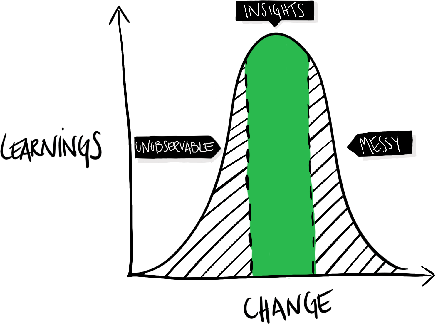
If we don’t change enough, the impact will be too small to be noticeable. The difference will be unobservable or negligible. If we change too much—e.g., completely redesign the entire product—the introduced changes and the produced outcomes can become a tangled mess. We’ve no idea what variable that caused what effect. Clear and valuable insights are somewhere in the middle. Developing a sense of how significant changes to test is part of learning how to utilize A/B-tests effectively. It’s different from product to product and depends on how well-optimized your product already is.

Importantly, this doesn’t mean that you shouldn’t test more significant and visionary changes or ideas—it just means that every test is a gamble, and the bigger the change, the higher the risk of blurring learnings. At the same time, an ambitious change might hit the jackpot and make a substantial and meaningful impact.

A defense against regressions

This process might seem to be a terribly expensive way of improving a product, and to be fair, it is. We’re spending a lot of time conducting tests that we could’ve spent building and shipping new features. So, why is it worth it? Or rather, when? As a rule of thumb, the more users you have, the more damage you can cause by shipping features that, despite your best intentions, happen to make the product worse for your average user.

The A/B-testing process really shines when it’s more expensive to make mistakes than to control for them. As your user base grows and your product matures, A/B-testing and data-driven design become an increasingly valuable tool not only to learn and iterate but to defend yourself against regressions. We can use it to gate the innovation process and only launch changes that we know make the product better—we introduce an objective selection process that only lets the fittest ideas survive. An overly zealous application of that selection process might shut out any change which’s effects aren’t quantifiable (which isn’t great—everything that matters isn’t quantifiable), but done right it can democratize the creative process and create an experimentation platform with clear goals and restrictions that we can iterate within.

Chaining styles with a JavaScript Proxy

2019-09-19 15:50:00

One of the delights of working with Ruby and jQuery is the ability to chain methods, enabling you to conveniently invoke multiple methods on the same target. In jQuery, for example, most methods return a jQuery object, so you can build a chain of methods where every new method operates on the previous target. This enables you to update some styles, run an animation, and update an attribute, all without querying for that element over and over again:

$(".menu")
  .css("color", "#fff")
  .data("mode", "light")
  .fadeIn();

Short and sweet. If you’ve updated the styles of an object with vanilla JavaScript, you might’ve been annoyed about the fact that you can’t chain style changes, and so you have to do something like this:

let menu = document.querySelector(".menu");
menu.style.color = "#fff";
menu.style.backgroundColor = "#000";
menu.style.opacity = "1";

There are a few different ways of making this more convenient, but the other day I started thinking about if it would be possible to use a Proxy object (at the time of writing, global support is at 92.76%) to enable chaining of style changes. Turns out, it’s relatively easy. We’ll walk through how to create a light-weight Proxy handler that will enable us to shorten the code above to this:

style(".menu")
  .color("#fff")
  .backgroundColor("#000")
  .opacity("1");

We’ll use roughly the same strategy as jQuery does: we’ll fetch the style object of an element and wrap it with a Proxy in order to intercept (trap) all get calls to that style object, take the accessed property and update its value if a value is passed, and then return the Proxy handler wrapping the style object again, enabling us to build an infinite chain of commands.

Since we’ll repurpose the get method to also act as a setter, we’ll retain the get functionality by returning the value of a property if you don’t pass any arguments to the function (i.e. you’ll get a value through style(".menu").color() rather than style(".menu").color). Here’s the gist of the technique:

let styleProxy = {
  get: (object, property) => {
    return (value) => {
      if (value) {
        object[property] = value;
        return new Proxy(object, styleProxy);
      }
      return object[property];
    }
  }
}

let style = (selector) => {
  let element = document.querySelector(selector);

  return new Proxy(element.style, styleProxy);
}

Let’s break it down, and quickly walk through how a Proxy works.

It’s a trap!

The first aspects to understand about using a Proxy are handlers and traps. We can create a handler to trap a series of operations, e.g. get(), set(), and apply(). In essence, we’ll get a chance to intercept those operations on the object we’re wrapping and do with them whatever we want—we can return different values depending on some logic, or simply forward the operation to the original target.

As a simple example, we can always return the same value regardless of what property you try to access, even if no property has been set on the original object:

let handler = {
  get: () => {
    return "hodor";
  }
}

let person = { name: "Wylis" } 
let proxied = new Proxy(person, handler);

console.log(person.name);  // "Wylis"
console.log(proxied.name); // "hodor"
console.log(proxied.age); //  "hodor"
console.log(proxied.favoriteFood); // "hodor"

Always return a function

This enables us to completely change how an object works. To enable chaining for the style object, we’ll expand get to also work as set. We’ll still only trap get, but rather than returning the value of a property when it’s accessed we’ll return a function that returns the value of the property only if the function is invoked without any arguments. If an argument is passed, we’ll use it to update that property’s value.

Let’s start by just getting the basics into place. Let’s create a new handler called getProxy, and create a get trap, where we always return a function. Thus if we just log a property, we’ll get a function. But if we invoke that function, we’ll see what it returns (in this case “test”):

let getProxy = {
  get: () => {
    return () => {
      return "test";
    }
  }
}

let proxied = new Proxy({}, getProxy);

console.log( proxied.name );   // Our function: (argument) => { return "test"; }
console.log( proxied.name() ); // The value: "test"

Use the function to get and set values

Inside our new function, we can check if an argument is being passed to it when it’s invoked. If something is passed, we can use that argument to update the property. If no arguments are passed we can simply return the value of that property, basically maintaining the original get functionality while expanding it with a set option.

Let’s create a new Proxy, this time called styleProxy. We’ll check if something is being passed to it, and get and set accordingly. Our proxy handler is also being passed an object (the object we’re wrapping and intercepting) and a property argument (the property we’re operating on), and we can use these two to operate on the original target.

let styleProxy = {
  get: (object, property) => {
    return (value) => {
      if (value) {
        // "object" is the object that we're wrapping
        // "property" is the property of the object that we're accessing
        // "value" is what we passed to the function
        // Let's use these three to update the style object:
        object[property] = value;
      } else {
        // If no arguments were passed, simply return the
        // value of that property:
        return object[property];
      }
    }
  }
}

This enables our handler’s get method to act both as a setter and getter:

style(".menu").color("#fff"); // Gets a function which updates color to "#fff"
style(".menu").color();       // No arguments passed, just returns "#fff"

Note that since we’re not creating a trap for the set operation, we can still set a property’s value by assigning a value to it directly:

// Works like expected
style(".menu").color = "#fff";

Return the style object wrapped in a proxy

Now that we’re in control of what’s being returned after we update a property, we can simply return the original style object wrapped in our Proxy handler if an argument is passed, completing our chaining method:

let styleProxy = {
  get: (object, property) => {
    return (value) => {
      if (value) {
        object[property] = value;
        // Return the original target, wrapped in the same Proxy handler
        return new Proxy(object, styleProxy);
      }
      return object[property];
    }
  }
}

When we use method chaining, then, this is what’s happening behind the scenes:

style(".menu")              // Returns the style object in a Proxy
  .color("#fff")            // Updates color and returns a Proxy
  .backgroundColor("#000")  // Updates bgColor and returns a Proxy
  .opacity("1");            // ... and so on so forth

Here’s the solution in full:

let styleProxy = {
  get: (object, property) => {
    return (value) => {
      if (value) {
        object[property] = value;
        return new Proxy(object, styleProxy);
      }
      return object[property];
    }
  }
}

let style = (selector) => {
  let element = document.querySelector(selector);

  return new Proxy(element.style, styleProxy);
}

I can’t confidently say that I recommend this approach—and I won’t be using it on this site anytime soon due to the just-too-low browser support, but I find it fascinating how bendable JavaScript is, and how with the Proxy API we can go even further.

Smoother & sharper shadows with layered box-shadows

2019-09-19 15:50:00

Default
Smooth

As light hits an object and a shadow is cast, the shadow can take on a myriad of unique characteristics. If you try to capture the subtleties of a real shadow with box-shadow then, well, you’re pretty much out of luck. The box-shadow CSS property isn’t exactly built to encourage expressiveness. It essentially produces a blurred silhouette of an object—you can change its offset, blur radius, spread, and color, but that’s it. We can’t get anywhere near to expressing the complexities and nuances of shadows in real life.

But with a simple CSS technique, we can expand our range of options. If we use layered box-shadows we can get more fine-grained control over how shadows are rendered:

box-shadow 0 6px 6px rgba(0,0,0,0.2);
Layered box-shadows gradually increasing offset/blur

Look at how square and clumsy the default box-shadow effect (first box) looks compared to the layered box-shadow (second box). We can achieve this effect by creating multiple box-shadows (separating each shadow with a comma), and increasing the offset and blur for every shadow (the box-shadow syntax is X-offset Y-offset blur color):

/* Default box-shadow */
.box {
  box-shadow: 0 3px 3px rgba(0,0,0,0.2);
}

/* Create smoother box-shadows by layering multiple
 * shadows with gradually increasing radius and offset */
.shadow-5 {
  box-shadow: 0 1px 1px rgba(0,0,0,0.12), 
              0 2px 2px rgba(0,0,0,0.12), 
              0 4px 4px rgba(0,0,0,0.12), 
              0 8px 8px rgba(0,0,0,0.12),
              0 16px 16px rgba(0,0,0,0.12);
}

This simple layering technique gives us more control over the rendering of shadows, and with it we can fine-tune sharpness, distance, and spread. You can for example increase or decrease the number of shadows to create a smaller or larger spread. (Note that if you increase the number of layers you’ll have to decrease the alpha value for each layer if you wish to keep the strength somewhat the same.)

Layered box-shadows 4 shadows with 15% alpha
Layered box-shadows 6 shadows with 11% alpha
.shadow-4 {
  box-shadow: 0 1px 1px rgba(0,0,0,0.15), 
              0 2px 2px rgba(0,0,0,0.15), 
              0 4px 4px rgba(0,0,0,0.15), 
              0 8px 8px rgba(0,0,0,0.15);
}

.shadow-6 {
  box-shadow: 0 1px 1px rgba(0,0,0,0.11), 
              0 2px 2px rgba(0,0,0,0.11), 
              0 4px 4px rgba(0,0,0,0.11), 
              0 8px 8px rgba(0,0,0,0.11), 
              0 16px 16px rgba(0,0,0,0.11), 
              0 32px 32px rgba(0,0,0,0.11);
}

Controlling sharpness is as easy as controlling spread, but we can use both the alpha value and the blur value of each layer to change the concentration of depth and the blur radius of the shadow respectively.

The examples above use the same alpha value for all layers, but we can let the alpha value decrease or increase with every layer to create more or less diffuse shadows. For the more concentrated shadow below, the innermost shadow (with the least offset and blur) has the highest alpha value, and it decreases with every layer. The opposite is true for the more diffuse shadow of the second box, where the innermost layer has the lowest alpha value:

Sharp Shadows with decreasing alpha
Diffuse Shadows with increasing alpha
.blog-shadow-sharp {
  box-shadow: 0 1px 1px rgba(0,0,0,0.25), 
              0 2px 2px rgba(0,0,0,0.20), 
              0 4px 4px rgba(0,0,0,0.15), 
              0 8px 8px rgba(0,0,0,0.10),
              0 16px 16px rgba(0,0,0,0.05);
}

.blog-shadow-diffuse {
    box-shadow: 0 1px 1px rgba(0,0,0,0.08), 
                0 2px 2px rgba(0,0,0,0.12), 
                0 4px 4px rgba(0,0,0,0.16), 
                0 8px 8px rgba(0,0,0,0.20);
}

We can also increase the blur in higher incremenents, to increase the spread and create softer, almost dreamy, effects:

Dreamy soft Higher blur increase
.blog-shadow-dreamy {
    box-shadow: 0 1px 2px rgba(0,0,0,0.07), 
                0 2px 4px rgba(0,0,0,0.07), 
                0 4px 8px rgba(0,0,0,0.07), 
                0 8px 16px rgba(0,0,0,0.07),
                0 16px 32px rgba(0,0,0,0.07), 
                0 32px 64px rgba(0,0,0,0.07);
}

Finally, we can control the distance by decoupling the blur radius and Y-offset, and increase the offset in bigger or smaller increments:

Shorter Shadows with smaller distances
Longer Shadows with larger distances
.shadow-shorter {
  box-shadow: 0 1px 1px rgba(0,0,0,0.11), 
              0 2px 2px rgba(0,0,0,0.11), 
              0 4px 4px rgba(0,0,0,0.11), 
              0 6px 8px rgba(0,0,0,0.11),
              0 8px 16px rgba(0,0,0,0.11);
}

.shadow-longer {
  box-shadow: 0 2px 1px rgba(0,0,0,0.09), 
              0 4px 2px rgba(0,0,0,0.09), 
              0 8px 4px rgba(0,0,0,0.09), 
              0 16px 8px rgba(0,0,0,0.09),
              0 32px 16px rgba(0,0,0,0.09);
}

Which combination of all of these techniques to use is of course highly dependent on the context that you’re working in, but with layered shadows we can at the very least gain some more control to help us achieve our desired look and feel.

Further reading

Cheat sheet for moving from jQuery to vanilla JavaScript

2019-07-21 15:50:00

jQuery is still a useful and pragmatic library, but chances are increasingly that you’re not dependent on using it in your projects to accomplish basic tasks like selecting elements, styling them, animating them, and fetching data—things that jQuery was great at. With broad browser support of ES6 (over 96% at the time of writing), now is probably a good time to move away from jQuery.

I recently removed jQuery from this blog and found myself googling for some of the patterns over and over again. To spare you the time, I’ve compiled this practical reference guide with some of the most common jQuery patterns and their equivalents in JavaScript. We’ll cover how to move over to vanilla JavaScript from these concepts and functions:

Selecting elements Events .css() Document ready Classes .ajax() Creating elements HTML & text

Selecting elements

Selecting one or several DOM elements to do something with is one of the most basic elements of jQuery. The equivalent to $() or jQuery() in JavaScript is querySelector() or querySelectorAll(), which, just like with jQuery, you can call with a CSS selector.

// jQuery, select all instances of .box
$(".box");

// Instead, select the first instance of .box
document.querySelector(".box");

// …or select all instances of .box  
document.querySelectorAll(".box");

Running a function on all elements in a selection

querySelectorAll() returns a NodeList containing all of the elements matching the query. Whereas you can run a function with jQuery on the entire selection of elements simply by calling the method on the jQuery object, however, you’ll have to iterate over the NodeList of elements using NodeList.forEach() in vanilla JavaScript:

// with jQuery
// Hide all instances of .box
$(".box").hide();

// Without jQuery
// Iterate over the nodelist of elements to hide all instances of .box
document.querySelectorAll(".box").forEach(box => { box.style.display = "none" })

Finding one element within another

A common jQuery pattern is to select an element within another element using .find(). You can achieve the same effect, scoping the selection to an element’s children, by calling querySelector or querySelectorAll on an element:

// With jQuery
// Select the first instance of .box within .container
var container = $(".container");
// Later...
container.find(".box");

// Without jQuery
// Select the first instance of .box within .container
var container = document.querySelector(".container");
// Later...
container.querySelector(".box");

Traversing the tree with parent(), next(), and prev()

If you wish to traverse the DOM to select a subling or a parent element relative to another element, you can access them through nextElementSibling, previousElementSibling and parentElement on that element:

// with jQuery
// Return the next, previous, and parent element of .box
$(".box").next();
$(".box").prev();
$(".box").parent();

// Without jQuery
// Return the next, previous, and parent element of .box
var box = document.querySelector(".box");
box.nextElementSibling;
box.previousElementSibling;
box.parentElement;

Working with events

There’s a myriad of ways to listen to events in jQuery, but whether you’re using .on(), .bind(), .live or .click(), you’ll make do with the JavaScript equivalent .addEventListener:

// With jQuery
$(".button").click(function(e) { /* handle click event */ });
$(".button").mouseenter(function(e) {  /* handle click event */ });
$(document).keyup(function(e) {  /* handle key up event */  });

// Without jQuery
document.querySelector(".button").addEventListener("click", (e) => { /* ... */ });
document.querySelector(".button").addEventListener("mouseenter", (e) => { /* ... */ });
document.addEventListener("keyup", (e) => { /* ... */ });

Event listening for dynamically added elements

jQuery’s .on() method enables you to work with “live” event handlers, where you listen to events on objects that get dynamically added to the DOM. To accomplish something similar without jQuery you can attach the event handler on an element as you add it to the DOM:

// With jQuery
// Handle click events .search-result elements, 
// even when they're added to the DOM programmatically
$(".search-container").on("click", ".search-result", handleClick);

// Without jQuery
// Create and add an element to the DOM
var searchElement = document.createElement("div");
document.querySelector(".search-container").appendChild(searchElement);
// Add an event listener to the element
searchElement.addEventListener("click", handleClick);

Triggering and creating events

The equivalent to manually triggering events with trigger() can be achieved by calling dispatchEvent(). The dispatchEvent() method can be invoked on any element, and takes an Event as the first argument:

// With jQuery
// Trigger myEvent on document and .box
$(document).trigger("myEvent");
$(".box").trigger("myEvent");

// Without jQuery
// Create and dispatch myEvent
document.dispatchEvent(new Event("myEvent"));
document.querySelector(".box").dispatchEvent(new Event("myEvent"));

Styling elements

If you’re calling .css() on an element to change its inline CSS with jQuery, you’d use .style in JavaScript and assign values to its different properties to achieve the same effect:

// With jQuery
// Select .box and change text color to #000
$(".box").css("color", "#000");

// Without jQuery
// Select the first .box and change its text color to #000
document.querySelector(".box").style.color = "#000";

With jQuery, you can pass an object with key-value pairs to style many properties at once. In JavaScript you can set the values one at a time, or set the entire style string:

// With jQuery
// Pass multiple styles
$(".box").css({
  "color": "#000",
  "background-color": "red"
});

// Without jQuery
// Set color to #000 and background to red
var box = document.querySelector(".box");
box.style.color = "#000";
box.style.backgroundColor = "red";

// Set all styles at once (and override any existing styles)
box.style.cssText = "color: #000; background-color: red";

hide() and show()

The .hide() and .show() convenience methods are equivalent to accessing the .style property and setting display to none and block:

// With jQuery
// Hide and show and element
$(".box").hide();
$(".box").show();

// Without jQuery
// Hide and show an element by changing "display" to block and none
document.querySelector(".box").style.display = "none";
document.querySelector(".box").style.display = "block";

Document ready

If you need to wait for the DOM to fully load before e.g. attaching events to objects in the DOM, you’d typically use $(document).ready() or the common short-hand $() in jQuery. We can easily construct a similar function to replace it with by listening to DOMContentLoaded:

// With jQuery
$(document).ready(function() { 
  /* Do things after DOM has fully loaded */
});

// Without jQuery
// Define a convenience method and use it
var ready = (callback) => {
  if (document.readyState != "loading") callback();
  else document.addEventListener("DOMContentLoaded", callback);
}

ready(() => { 
  /* Do things after DOM has fully loaded */ 
});

Working with classes

You can easily access and work with classes through the classList property to toggle, replace, add, and remove classes:

// With jQuery
// Add, remove, and the toggle the "focus" class
$(".box").addClass("focus");
$(".box").removeClass("focus");
$(".box").toggleClass("focus");

// Without jQuery
// Add, remove, and the toggle the "focus" class
var box = document.querySelector(".box");
box.classList.add("focus");
box.classList.remove("focus");
box.classList.toggle("focus");

If you want to remove or add multiple classes you can just pass multiple arguments to .add() and .remove():

// Add "focus" and "highlighted" classes, and then remove them
var box = document.querySelector(".box");
box.classList.add("focus", "highlighted");
box.classList.remove("focus", "highlighted");

If you’re toggling two classes that are mutually exclusive, you can access the classList property and call .replace() to replace one class with another:

// Remove the "focus" class and add "blurred"
document.querySelector(".box").classList.replace("focus", "blurred");

Checking if an element has a class

If you only want to run a function depending on if an element has a certain class, you can replace jQuery’s .hasClass() with .classList.contains():

// With jQuery
// Check if .box has a class of "focus", and do something
if ($(".box").hasClass("focus")) {
  // Do something...
}

// Without jQuery
// Check if .box has a class of "focus", and do something
if (document.querySelector(".box").classList.contains("focus")) {
  // Do something...
}

Network requests with .get() or .ajax()

fetch() lets you create network requests in a similar fashion to jQuery’s ajax() and get() methods. fetch() takes a URL as an argument, and returns a Promise that you can use to handle the response:

// With jQuery
$.ajax({
    url: "data.json"
  }).done(function(data) {
    // ...
  }).fail(function() {
    // Handle error
  });

// Without jQuery
fetch("data.json")
  .then(data => {
    // Handle data
  }).catch(error => {
    // Handle error
  });

Creating elements

If you want to dynamically create an element in JavaScript to add to the DOM you can call createElement() on document and pass it a tag name to indicate what element you want to create:

// Create a div & span
$("<div/>");
$("<span/>");

// Create a div and a span
document.createElement("div");
document.createElement("span");

If you want to add some content to those elements, you can simply set the textContent property, or create a text node with createTextNode and append it to the element:

var element = document.createElement("div");
element.textContent = "Text"
// or create a textNode and append it
var text = document.createTextNode("Text");
element.appendChild(text);

Updating the DOM

If you’re looking to change the text of an element or to add new elements to the DOM chances are that you’ve come across innerHTML(), but using it may expose you to cross-site scripting (XSS) attacks. Although you can work around it and sanitize the HTML, there are some safer alternatives.

If you’re only looking to read or update the text of an element, you can use the textContent property of an object to return the current text, or update it:

// With jQuery
// Update the text of a .button
$(".button").text("New text");
// Read the text of a .button
$(".button").text(); // Returns "New text"

// Without jQuery
// Update the text of a .button
document.querySelector(".button").textContent = "New text";
// Read the text of a .button
document.querySelector(".button").textContent; // Returns "New text"

If you’re constructing a new element, you can then add that element to another element by using the method on the parent appendChild():

// Create div element and append it to .container
$(".container").append($("<div/>"));

// Create a div and append it to .container
var element = document.createElement("div");
document.querySelector(".container").appendChild(element);

Put together, here’s how to create a div, update its text and class, and add it to the DOM:

// Create a div
var element = document.createElement("div");

// Update its class
element.classList.add("box");

// Set its text
element.textContent = "Text inside box";

// Append the element to .container
document.querySelector(".container").appendChild(element);

In summary

This is by no means a comprehensive guide to any of the native JavaScript methods utilized here, but I hope it’s been helpful a guide if you’re looking to move away from jQuery. In summary, here are the methods that we’ve covered:

Breaking to a new row with flexbox

2019-04-29 15:50:00

Here’s the challenge: if you want to create a flexbox layout with several rows of items, how do you control which item ends up in which row? Presume you want to create a layout that looks something like this, with three stacked items and alternating full-width items:

A common way of controlling the positioning and size of flex items is to use width or flex-basis; if we set the fourth item to have a width of 100% it’ll be positioned on its own row. But what if we don’t want to or can’t set the width of individual items, do we really need to? Or is there a way of just telling flexbox to line break at certain points?

There’s no property that we can set on a flex item to make it break to a new row, but we can insert a collapsed row (you can think of it as a <br>) between two flex items two achieve something similar. In a gist:

/* Inserting this collapsed row between two flex items will make 
 * the flex item that comes after it break to a new row */
.break {
  flex-basis: 100%;
  height: 0;
}
<div class="container">
  <div class="item"></div>
  <div class="break"></div> <!-- break -->
  <div class="item"></div>
</div>

Let’s walk through some scenarios when you might want to use this, and look at some interesting layout techniques that it enables us to use.

Note that all of the code examples below requires and assumes that you have a flex container with display: flex and flex-wrap: wrap and that the flex items are added to that container:

.container {
  display: flex;
  flex-wrap: wrap;
}
<div class="container">
  <div class="item"></div>
  <div class="item"></div>
  <div class="item"></div>
  ...
</div>

Inserting a line-breaking flex item

Using an element to break to a new flex row comes with an interesting effect: we can skip specifying the width of any item in our flex layout and rely completely on the line breaks to define the flow of our grid.

Let’s start with a simple example. Say that we have two items shown side by side (these are set to grow with flex-grow: 1, and they have no defined width or flex-basis):

We can insert a line breaking element between the items to make them both take up 100% of the available space:

<div class="item">...</div>
<div class="break"></div> <!-- break to a new row -->
<div class="item">...</div>

This produces a layout with two vertically stacked full-width items (I’ve added a border to the .break element to illustrate its position and behavior):

How does this work? Since we’ve said that .break should take up 100% of the width of the container (because we set flex-basis: 100%), the breaking flex item needs to sit on its own row to accomplish that. It can’t share a row with the first item so it will break to a new row, which will leave the first item alone on one row. The first item will then grow to fill the remaining space (since we set flex-grow: 1). The same logic applies to the second item.

We can use this technique to compose the layout at the top of the post by breaking before and after every fourth item:

<div class="item">...</div>
<div class="break"></div> <!-- break -->
<div class="item">...</div>
<div class="break"></div> <!-- break -->
<div class="item">...</div>

This will produce the layout at the top of the blog post. Essentially an item won’t break to a new row unless we insert the line-breaking element:

Again, we didn’t need to specify the width on any of those items. The same technique will work for columns if we have a flex container with flex-direction: column, and set the width (rather than height) to 0 for our breaking element:

/* Use a collapsed column to break to a new column */
.break-column {
  flex-basis: 100%;
  width: 0;
}

This approach of using line breaking elements to define a layout definitely adds some bloat and noise to our HTML, but it can be a powerful tool when used in the right way. We can, for example, use it to build a masonry layout with CSS only, and position the breaks dynamically with the order property. We can also break to a new row without having to modify the width of any content item, and we can rely solely on flex-grow to distribute space in a grid layout.

Suppose that we’re looking to create this layout:

And assume that we want to do so by setting different values of flex-grow to distribute the space (rather than using flex-basis or width, which you’d have to recalculate as soon as you added or removed items):

.item { flex-grow: 1; }
.item-wide { flex-grow: 3; }
<div class="item"></div>
<div class="item-wide"></div>
<div class="item"></div>

If we then want to add another row of items below that row:

We wouldn’t be able to do so without resorting to setting flex-basis or width on at least some of the items (or creating a nested flexbox layout with one flex item for every row). If all of the items just have different values of flex-grow nothing would make them break to a new row, they’d all just squeeze in on one row together:

Cozy, but not what we’re after. If we insert a breaking element, however, we can construct this layout by distributing all space with flex-grow:

.item { flex-grow: 1; }
.item-wide { flex-grow: 3; }
<div class="item"></div>
<div class="item-wide"></div>
<div class="item"></div>
<div class="break"></div> <!-- break -->
<div class="item"></div>

Yielding the desired layout, with all sizes defined proportionally through flex-grow:

And if there’s a scenario when we need five items in the first row we don’t have to change any of the CSS to make that work, we can just add those items before the line break:

<div class="item"></div>
<div class="item-wide"></div>
<div class="item"></div>
<div class="break"></div> <!-- break -->
<div class="item"></div>

All that you need to add to your CSS to use line-breaking elements are these two classes (the only difference between the two classes is that width (and not height) needs to be set to 0 for the element to collapse when used in a column layout):

/* Inserting a collapsed row between two flex items will make 
 * the flex item that comes after it break to a new row */
.break {
  flex-basis: 100%;
  height: 0;
}

/* Use a collapsed column to break to a new column */
.break-column {
  flex-basis: 100%;
  width: 0;
}

You could certainly achieve the same effect or similar effects by nesting flexboxes and having one flex item for every row, and in many cases just utilizing flex-basis, width, or the content within the flex items is probably the preferred way of controlling the flow of items in a flexbox layout. But inserting line-breaking flex items is approachable and easy to grok, it works, and the technique comes with some unique characteristics that may come in handy.

CSS masonry with flexbox, :nth-child(), and order

2019-04-15 19:12:00

On the surface it seems fairly easy to create a masonry layout with flexbox; all you need to do is set flex-flow to column wrap and voilà, you have a masonry layout. Sort of. The problem with this approach is that it produces a grid with a seemingly shuffled and obscure order. Items will be (unbeknownst to the user) rendered from top to bottom and someone parsing the grid from left to right will read the boxes in a somewhat arbitrary order, for example 1, 3, 6, 2, 4, 7, 8, 5, and so on so forth.

Flexbox has no easy way of rendering items with a column layout while using a row order, but we can build a masonry layout with CSS only—no JavaScript needed—by using :nth-child() and the order property. In a gist, here’s the trick to create a row order while using flex-direction: column, given that you’re rendering three columns:

/* Render items as columns */
.container {
  display: flex;
  flex-flow: column wrap;
}

/* Re-order items into rows */
.item:nth-child(3n+1) { order: 1; }
.item:nth-child(3n+2) { order: 2; }
.item:nth-child(3n)   { order: 3; }

/* Force new columns */
.container::before,
.container::after {
  content: "";
  flex-basis: 100%;
  width: 0;
  order: 2;
}

This will create a masonry layout with items rendered as columns but ordered as rows (the gray vertical lines represent the pseudo elements that force line breaks:

1
2
3
4
5
6
7
8
9
10

Let’s break down the implementation (or jump to the solution, or see the codepen collection).

Pick your poison: a shuffled order, or weird gaps

Flexbox is not really built for masonry—if you set a fixed height on a flex container (so that items can wrap when they overflow) and flex-flow to column wrap, you’ll achieve something like this:

1
2
3
4
5
6
7
8
9
10

Items are rendered in columns from top to bottom, producing an arbitrary order when read from left to right. This is of course the expected outcome and desirable in many scenarios, but not when we’re trying to create a masonry layout, and it becomes increasingly disorienting as a page grows taller.

If we instead change the flex-direction to row and have elements of varying heights we’ll achieve the correct order but with weird and unexpected gaps all over our grid:

1
2
3
4
5
6
7
8
9
10

So it seems impossible to get the best of both worlds: items rendered as columns but ordered as rows. You might decide to use flex-direction: column and just move around the elements in your HTML to achieve the right visual order, but this can be cumbersome, it’s unnecessarily complex, and it will mess up the tab order of the elements.

Re-ordering elements with order and nth-child()

The order property affects the order of items contained in a CSS flexbox or grid, and we can use it to re-order items for our soon-to-be masonry layout. The order property is pretty straight-forward to use: if you have two elements and one has order: 1 and the other one has order: 2 the element with order: 1 will be rendered before the other element, independent of their HTML source code order.

The CSS masonry solution depends on a detail of the order specification: what happens if two or more elements have the same order value? Which comes first? Flexbox falls back on the source code order: the element that appears first in the source code will be rendered before other elements with the same order value. This fact gives us the possibility to easily re-group items in our grid so that we can change the ordering from columns to rows, while still rendering those rows as columns, using nth-child().

Look at the table below. To achieve a sensible order using flex-direction: row we’d just have to render elements in the default order: 1, 2, 3, 4, 5, 6 , etc.

  Column 1 Column 2 Column 3
Row 1 1 2 3
Row 2 4 5 6
Row 3 7 8 9
Row 4 10 11 12

If we want to achieve the same order while using flex-direction: column we need to change the order of the elements to match the order of each column in the table (rather than each row):

  Column 1 Column 2 Column 3
Row 1 1 2 3
Row 2 4 5 6
Row 3 7 8 9
Row 4 10 11 12

I.e. the first elements in our flexbox layout have to be 1, 4, 7, 10. These items will fill up the first column, followed by 2, 5, 8, 11 for the 2nd column and 3, 6, 9, 12 for the 3rd and last column. This is where the nth-child() selector comes in. We can use it to select every third element (3n), starting with the first element (3n+1), and set all those elements to have the same order value:

.item:nth-child(3n+1) { order: 1; }

This selector sets order: 1 for element 1, 4, 7, 10 in our container, i.e. the entire first column. In other words we’re using a combination of nth-child() and order to re-order items depending on their original order. To create the 2nd and 3rd column we just change the offset:

.item:nth-child(3n+1) { order: 1; }
.item:nth-child(3n+2) { order: 2; }
.item:nth-child(3n)   { order: 3; }

Here we’re producing three sets: 1, 4, 7, 10 (3n+1) with order: 1, 2, 5, 8, 11 (3n+2) with order: 2, and 3, 6, 9, 12 (3n) with order: 3. All together the order becomes 1, 4, 7, 10, 2, 5, 8, 11, 3, 6, 9, 12.

If we make sure to render each of those groups as one column (and no more), it’ll create the illusion that the items have returned to their original order when you read from left to right. If we visually parse the grid as rows the first row will contain the first element from every group (1, 2, 3), the second row will contain the second element from every group (4, 5, 6), and so on so forth. With this technique we can create a masonry layout with items rendered as columns but ordered as rows.

1
2
3
4
5
6
7
8
9
10

How is the tab order affected by shuffling around elements like this? Luckily, not at all. order only changes the visual representation of objects, not the tab order, so tabbing through the grid will work as intended.

Preventing columns from merging

If you have many items in a masonry layout this technique will fairly certainly break down at some point. We’re counting on that every “group” that we’ve created will be rendered as exactly one column but in reality items can have different heights and columns can easily start to merge. The first column could be longer than the other two, for example, which could make the third column start at the end of the second column:

1
2
3
4
5
6
7
8
9
10

The highlighted box here (3) has to be rendered at the start of the third column or the ordering algorithm will break, but if there’s space for another element at the end of the 2nd column it will naturally be rendered there.

We can fix this wrapping issue by forcing columns to restart at certain points. There’s no easy way of saying “this element should line break” with flexbox, but we can achieve this effect by adding invisible elements that take up 100% of the container’s height. As they require 100% of the parent’s height to be rendered they won’t fit in a column together with any other element, so they’ll essentially force line breaks by creating collapsed columns.

We have to insert these line break elements into our grid and array of elements, so what we’re looking for is to create this sequence of elements: 1, 4, 7, 10, <break>, 2, 5, 8, 11, <break>, 3, 6, 9, 12. We can use pseudo-elements on the container to add these, and we can set the order to 2 on both of them. Adding a pseudo-element with :before will make it the first child of the container and adding a pseudo-element with :after will make it the last child of the container, so if we set order: 2 on both of them they will become the first and the last element of the order: 2 “group” (as they appear before and after the other elements): :before, 2, 5, 8, 11, :after.

/* Force new columns */
.container::before,
.container::after {
  content: "";
  flex-basis: 100%;
  width: 0;
  order: 2;
}

I’ve highlighted the pseudo-elements below to show their effect. Notice that despite that box 3 would fit in the 2nd column it’s rendered as the first element in the last column:

1
2
3
4
5
6
7
8
9
10

The solution

As a final step, you need to make sure that your flex container has a set height that makes it taller than your tallest column (so that all columns will fit). Put together, this will produce a CSS masonry layout with three columns (also available as a codepen):

.container {
  display: flex;
  flex-flow: column wrap;
  align-content: space-between;
  /* Your container needs a fixed height, and it 
   * needs to be taller than your tallest column. */
  height: 600px; 
}

.item {
  width: 32%;
  margin-bottom: 2%; /* Optional */
}

/* Re-order items into 3 rows */
.item:nth-child(3n+1) { order: 1; }
.item:nth-child(3n+2) { order: 2; }
.item:nth-child(3n)   { order: 3; }

/* Force new columns */
.container::before,
.container::after {
  content: "";
  flex-basis: 100%;
  width: 0;
  order: 2;
}

Your HTML should look like this, with one <div /> for every item in your grid:

<div class="container">
  <div class="item"></div>
  <div class="item"></div>
  <div class="item"></div>
  ...
</div>

Working with more than three columns

To create a masonry layout with more than three columns we need to do a few things: adapt our sorting algorithm, update the width of the items, and insert line break elements manually (instead of using pseudo-elements). For quick access to the final result I’ve compiled a list of codepens showcasing flexbox masonry with 3, 4, 5 and 6 columns.

Since we’re limited to creating just two pseudo-elements with :before and :after we need to resort to manually adding break elements into our container (you need one less break element than the number of columns in your layout). You can just append them to the end of your container, they’ll be sorted into their respective columns:

<div class="container">
  <div class="item"></div>
  <div class="item"></div>
  <div class="item"></div>
  <div class="item"></div>
  ...
  <span class="item break"></span>
  <span class="item break"></span>
  <span class="item break"></span>
</div>

We’re inserting column breaks as spans in order to sort them independently from the content items. We need a way to “restart” the counting once we reach the break elements, or an uneven number of content items could make the first break element start after the 3rd column, for example. The :nth-of-type selector targets elements of different types independently, so we can decouple the order of the content items and the column breaks like so:

.item:nth-of-type(4n+1) { order: 1; }
.item:nth-of-type(4n+2) { order: 2; }
.item:nth-of-type(4n+3) { order: 3; }
.item:nth-of-type(4n)   { order: 4; }

The break elements, like previously, take up the full height of the container:

/* Force new columns */
.break {
  flex-basis: 100%;
  width: 0;
  margin: 0;
}

This will create a masonry layout with four columns (view codepen):

1
2
3
4
5
6
7
8
9
10
11
12

Here’s the full solution for a CSS masonry layout with four columns:

.container {
  display: flex;
  flex-flow: column wrap;
  align-content: space-between;
  /* Your container needs a fixed height, and it 
   * needs to be taller than your tallest column. */
  height: 600px; 
}

.item {
  width:24%;
  margin-bottom: 2%; /* Optional */
}

/* Re-order items into 4 rows */
.item:nth-of-type(4n+1) { order: 1; }
.item:nth-of-type(4n+2) { order: 2; }
.item:nth-of-type(4n+3) { order: 3; }
.item:nth-of-type(4n)   { order: 4; }

/* Force new columns */
.break {
  flex-basis: 100%;
  width: 0;
  margin: 0;
}

This CSS-only way of creating a masonry (or mosaic) layout is surely not as robust, flexible, and foolproof as a JavaScript implementation (like Masonry) but if you don’t want to rely on a third-party library just to create a masonry layout I hope that these layouts tricks can come in handy.

For help with more common CSS flexbox patterns, I’ve compiled a list of flexbox examples that you can copy and paste into your projects and written in-depth about the line-breaking flexbox item technique.

Further reading

Common CSS Flexbox Layout Patterns with Example Code

2019-04-15 18:12:00

In theory, it’s pretty straightforward to use flexbox (Flexible Box Module) to build complex layouts, but I’ve often found myself adding display: flex to an element and then promptly spending an eternity trying to figure out how to make anything behave like I expect it to. If you’re anything like me: here’s a list of 10 example flexbox layouts with CSS that you can copy and paste to get started with your own layouts. We’ll walk through these basic layout patterns (click to jump to an example):

Stretch all
Stretch middle
Alternating grid
3x3 grid
3x3 (1:1)
3x3 (16:9)
Vertical bars
Horizontal bars
Vertical stack
Masonry

Every example assumes that your HTML contains an element with a class of container which then contains several children that all have a class of item (the number of children varies per example):

<div class="container">
  <div class="item"></div>
  <div class="item"></div>
  <div class="item"></div>
  ...
</div>

Stretch all, fixed spacing

The most basic flexbox pattern: getting a few boxes to stretch and fill the full width of their parent element. All you need to do is to set display: flex on the container, and a flex-grow value above 0 on the children:

.container {
  display: flex;
}

.item {
  flex-grow: 1;
  height: 100px;
}

.item + .item {
  margin-left: 2%;
}

We use a + selector to only add gaps between pairs of items (essentially just skipping the left margin for the first item in the list).

Increasing flex-grow will increase the amount of space that an element is allowed to stretch to compared to any other element. If we set flex-growto 2 on the middle element here, we would basically divide up the available space into 6 chunks (1 chunk for each item plus 1 extra for the middle item, 1+1+2+1+1). The middle item gets two chunks (flex-grow: 2) worth of space, and all other elements get one chunk (flex-grow: 1).

Stretch middle, fixed spacing

A common app and web pattern is to create a top bar where we want to stretch only the middle element, but keep the right most and left most elements fixed. If we just want one element to stretch, we can set a fixed width (e.g. 100px) on an element that should stay static, and flex-grow: 1 on the element that should stretch:

.container {
  display: flex;
}

.item {
  height: 100px;
  width: 100px; /* A fixed width as the default */
}

.item-center { 
  flex-grow: 1; /* Set the middle element to grow and stretch */
}

.item + .item { 
  margin-left: 2%; 
}

Even if the middle element here has a defined width of 100px, flex-grow will make it stretch to take up all the available space.

Alternating grid

A layout pattern that I use on my blog overview is to create a grid with some variation: after every row of two equally sized items there’s one item that takes up an entire row:

To accomplish this we need to:

  1. Set flex-wrap: wrap on the container (or all items would be rendered on a single row)
  2. Set justify-content: space-between on the container, to only create space between the elements (and not between the edge of the parent element and items)
  3. Set every item’s width to 49% (or something similar that is equal to or less than 50%)
  4. Set every third item’s width to 100% so that it fills that entire row. We can target every third item in the list with the nth-child() selector.
.container {
  display: flex;
  flex-wrap: wrap;
  justify-content: space-between;
}

.item {
  width: 48%;
  height: 100px;
  margin-bottom: 2%;
}

.item:nth-child(3n) {
  width: 100%;
}

If you want the first row to be full-width and the two following items to share a row, note that you can’t write .item:nth-child(1n) { width: 100% }—that would target all items. You have to target the first item by selecting every third element, and then stepping back two items: .item:nth-child(3n-2) { width: 100% }.

3x3 grid

We can create a 3x3 grid by setting flex-grow to 0 and flex-basis to the preferred width for all children (here done using the flex short-hand: flex: 0 32%). The margins between the items are the leftovers from every row, i.e. (100%-32x3)/2=2%. I’ve matched the margin (margin-bottom: 2%) to achieve even spacing between all elements:

.container {
  display: flex;
  flex-wrap: wrap;
  justify-content: space-between;
}

.item {
  flex: 0 32%;
  height: 100px;
  margin-bottom: 2%; /* (100-32*3)/2 */
}

You can change the flex-basis to increase or decrease the number of items on each row. flex: 0 24% would put 4 items on every row, flex: 0 19% would put 5 items on every row, and so on so forth.

3x3 grid, constrained proportions (1:1)

We can create a grid full of items with constrained proportions by using a somewhat hacky padding CSS trick. If we use % when setting padding on an element the padding is set relative to that item’s parent’s width, .container in this case. We can use that effect to create a square by setting an item’s width and padding-bottom to the same value (and effectively setting the height of that element through padding-bottom):

.container {
  display: flex;
  flex-wrap: wrap;
  justify-content: space-between;
}

.item {
  width: 32%;
  padding-bottom: 32%; /* Same as width, sets height */
  margin-bottom: 2%; /* (100-32*3)/2 */
  position: relative;
}

Since we’ve created an element that is effectively made up of only padding, and there’s no place left for content, we need to set position: relative on the .item in this example and add a child element with position: absolute, and use that element to “reset” the canvas and add content.

3x3 grid, constrained proportions (16:9)

To change the proportions of the items all you need to do is change the proportions of the width and padding-bottom on the .item. Changing the width would affect the number of items on each row, so as to not affect the grid structure we can for example change padding-bottom to 18% to create 16:9 (equivalent to 32:18) rectangles.

.container {
  display: flex;
  flex-wrap: wrap;
  justify-content: space-between;
}

.item {
  width: 32%;
  padding-bottom: 18%; /* 32:18, i.e. 16:9 */
  margin-bottom: 2%; /* (100-32*3)/2 */
}

Graph: vertical bars

If you want to use flexbox to create a simple graph visualization, all you need to do is to set align-items of the container to flex-end and define a height for each bar. flex-end will make sure that the bars are anchored to the bottom of the graph.

.container {
  display: flex;
  height: 300px;
  justify-content: space-between;
  align-items: flex-end;
}

.item { width: 14%; }
.item-1 { height: 40%; }
.item-2 { height: 50%; }
.item-3 { height: 60%; }
.item-4 { height: 20%; }
.item-5 { height: 30%; }

Graph: horizontal bars

Using the same technique as for vertical bars, we can simply add flex-direction on the container with a value of column to create a set of horizontal bars. flex-direction can have a value of row (default) or column, where a row runs horizontally (→) and a column runs vertically (↓). You can also reverse the direction of both by using row-reverse (←) and column-reverse (↑) respectively.

.container {
  display: flex;
  height: 300px;
  justify-content: space-between;
  flex-direction: column;
}

.item { height: 14%; }
.item-1 { width: 40%; }
.item-2 { width: 50%; }
.item-3 { width: 60%; }
.item-4 { width: 20%; }
.item-5 { width: 30%; }

Vertical stack (centered)

To create a vertical stack and make the items run from top to bottom all we need to do is to change the flex-direction from the default value of row to column:

.container {
  display: flex;
  flex-direction: column;
  align-items: center;
}

.item {
  height: 40px;
  margin-bottom: 10px;
}

Masonry (or mosaic)

1
2
3
4
5
6
7
8
9
10

You’ve probably seen masonry (or mosaic) layouts all over the internet, but it’s likely that they were all powered by Masonry or a similar JavaScript library. Flexbox might seem like a great candidate to finally create this layout with CSS only, and it’s certainly possible, but it’s surprisingly hacky.

One of the main challenges of creating a masonry layout with flexbox is that to make an item affect the positioning of an item above and below it we need to change the flex-direction of the container to column, which makes items run from top to bottom. This creates a layout that looks great, and similar to the masonry effect, but it could be confusing for users; it creates an unexpected ordering of elements. If you read from left to right the elements would seem to be shuffled and appear in a seemingly random order, for example 1, 3, 6, 2, 4, 7, 8, etc.

Luckily, we can use the order property to change in which order elements are rendered. We can combine that property with some clever use of the nth-child() selector to order items dynamically depending on their original order. If we want to create a masonry layout with three columns we can divide all the items into three “groups”, like so:

/* Re-order items into rows */
.item:nth-child(3n+1) { order: 1; }
.item:nth-child(3n+2) { order: 2; }
.item:nth-child(3n)   { order: 3; }

/* Force new columns */
.container::before,
.container::after {
  content: "";
  flex-basis: 100%;
  width: 0;
  order: 2;
}

I’ve written another post that explains in detail how this works and why. This will set the order to 1 for the 1st element, 4th element, 7th element, etc. Elements with the same order value will be ordered on ascending order according to the source code order, or which value was set first, so in this example we’re producing three sets ordered like so: 1, 4, 7, 10 (3n+1) with order: 1, 2, 5, 8 (3n+2) with order: 2, and 3, 6, 9 (3n) with order: 3. These three groups represent our three columns. Put together the order becomes 1, 4, 7, 10, 2, 5, 8, 3, 6, 9.

If we make sure to render each of those groups as one column (no more, no less), it’ll create the illusion that the items have returned to their original order when you read from left to right. If we visually parse the grid as rows, the first row will contain the first element from every group (1, 2, 3), the second row will contain the second element from every group (4, 5, 6), and so on so forth. We then insert elements between the columns that take up 100% of the parent’s height, which force the columns to line break and not accidentally merge with adjacent columns. Here’s the full CSS snippet:

.container {
  display: flex;
  flex-flow: column wrap;
  align-content: space-between;
  height: 580px;
}

.item {
  width: 32%;
  margin-bottom: 2%; /* (100-32*3)/2 */
}

/* Re-order items into rows */
.item:nth-child(3n+1) { order: 1; }
.item:nth-child(3n+2) { order: 2; }
.item:nth-child(3n)   { order: 3; }

/* Force new columns */
.container::before,
.container::after {
  content: "";
  flex-basis: 100%;
  width: 0;
  order: 2;
}

Visually this achieves something that is very close to the masonry effect. How is the tab order affected? Luckily, not at all. order only changes the visual representation of objects, not the tab order, so tabbing through the grid will work as intended.

If you want to make a masonry layout with more than three columns (or want a better understanding of how this works) I recommend reading the dedicated post on how to create masonry layouts with CSS.